Web App Product Design

Web App Product Design

Web App Product Design

MixRank Product
UI & UX Case Study

MixRank Product
UI & UX Case Study

  1. About

About the MixRank Product

The MixRank Product curates a real-time stream of the latest people, company, and technographic datasets and allows the user to access valuable data related insights through a user centric user interface.

Why did we require a change in design?

To increase the usability of the product, adhere it to modern design standards and to add/fix requested customer features

My Role and Responsibilities

Wireframing and Structuring

Iterative Mockup Design & Prototyping

User Research & Competitor Analysis

  1. User Research

To conduct user research, a comprehensive strategy was employed. Initially, discussions took place with the Growth team to garner insight into the requirements and obstacles faced by prospective customers seeking data-driven sales solutions. Furthermore, an examination of feedback from current customers was conducted to grasp their practical experiences, shaping the frustrations and objectives reflected in the user persona. Additionally, research, encompassing industry websites, forums, and social media platforms, played a crucial role in pinpointing prevalent pain points shared among comparable companies.

a. User Persona

b. Competitors Analyzed

c. Existing Product Design

d. User Pain Points

  1. Data Overload (cluttered data)

Sorting through vast datasets can pose challenges for the user. The sheer volume of information can be overwhelming and may hinder efficient decision-making.

  1. User's need to filter data

Insufficient or cumbersome filtering options hinder the user's ability to extract specific insights necessary for strategic decision-making, impacting the efficiency of their data exploration process.


  1. Navigating the data

Navigating through complex datasets requires a balance of precision and simplicity. The user may encounter challenges in efficiently locating specific information due to the intricate nature of the data.

  1. User Research

To conduct user research, a comprehensive strategy was employed. Initially, discussions took place with the Growth team to garner insight into the requirements and obstacles faced by prospective customers seeking data-driven sales solutions. Furthermore, an examination of feedback from current customers was conducted to grasp their practical experiences, shaping the frustrations and objectives reflected in the user persona. Additionally, research, encompassing industry websites, forums, and social media platforms, played a crucial role in pinpointing prevalent pain points shared among comparable companies.

a. User Persona

b. Competitors Analyzed

c. Existing Product Design

d. User Pain Points

  1. Data Overload (cluttered data)

Sorting through vast datasets can pose challenges for the user. The sheer volume of information can be overwhelming and may hinder efficient decision-making.

  1. User's need to filter data

Insufficient or cumbersome filtering options hinder the user's ability to extract specific insights necessary for strategic decision-making, impacting the efficiency of their data exploration process.


  1. Navigating the data

Navigating through complex datasets requires a balance of precision and simplicity. The user may encounter challenges in efficiently locating specific information due to the intricate nature of the data.

  1. Ideation and Design - Phase 1

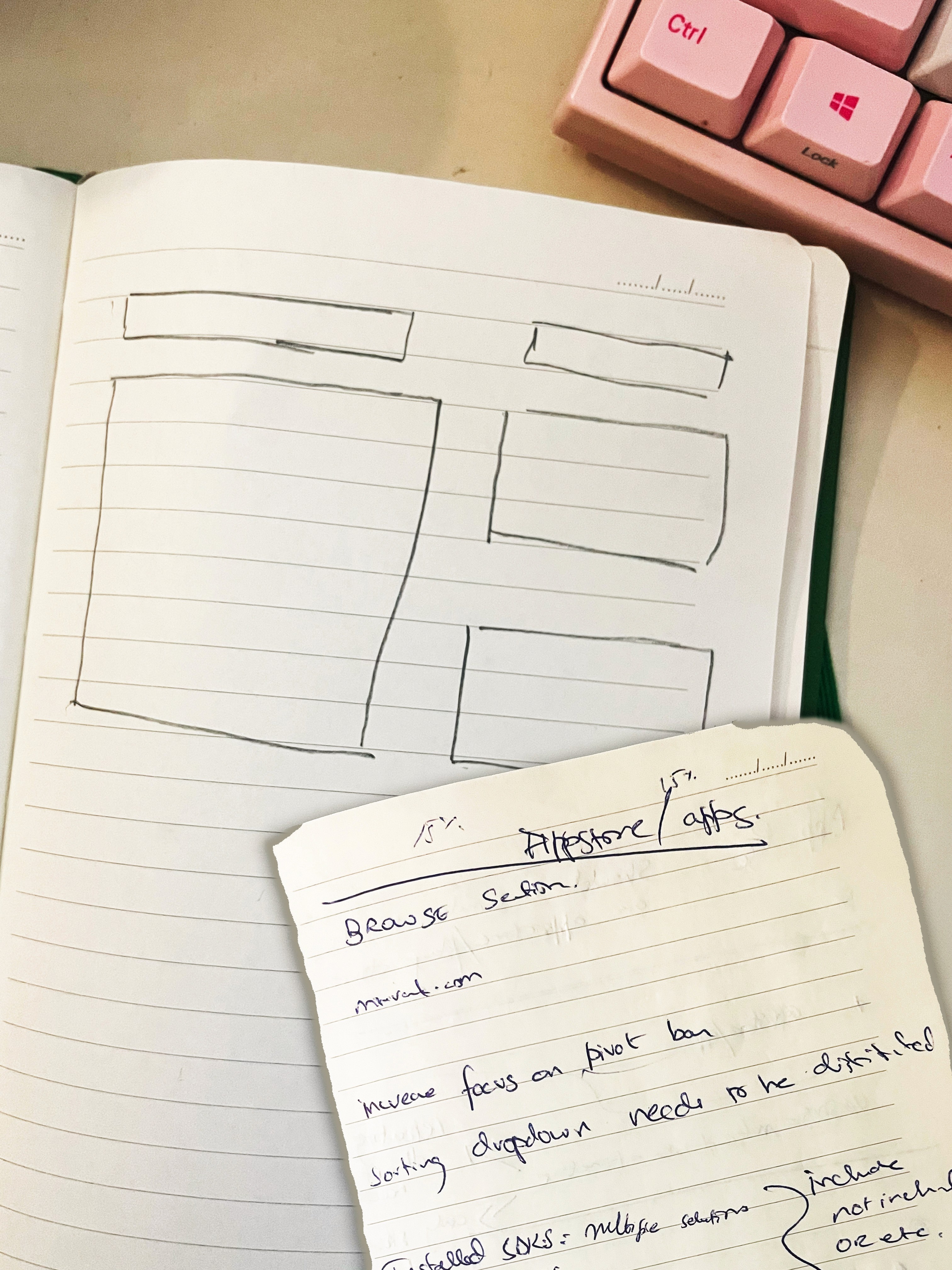
The design process kicked off with the initial sketching of paper wireframes, leveraging insights gathered from user research and available information. Building on these foundations, various components were crafted, leading to the creation of a fully functional high fidelity prototype. The rationale behind design decisions will be detailed in the following sections.

a. Paper Wireframes

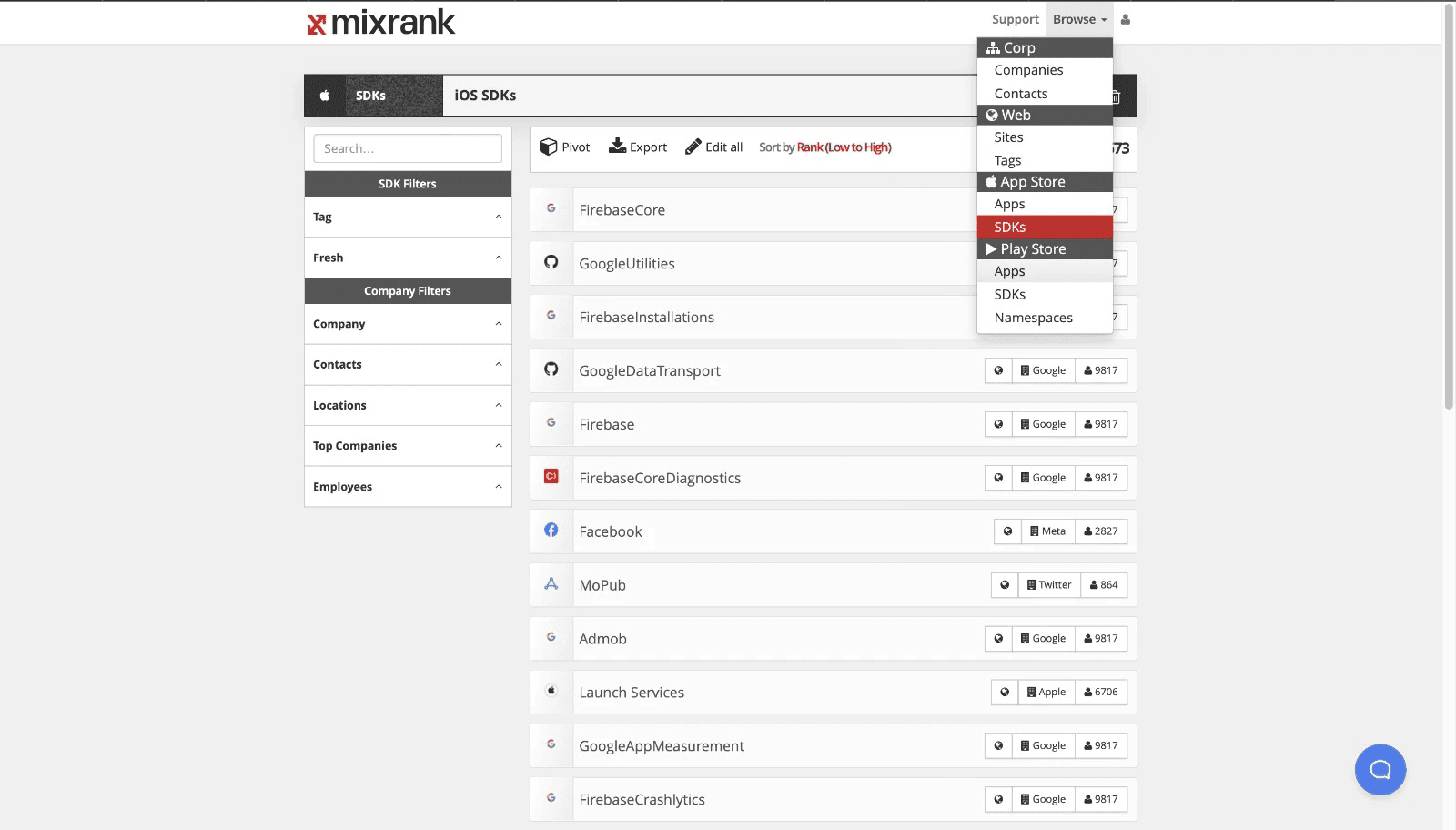
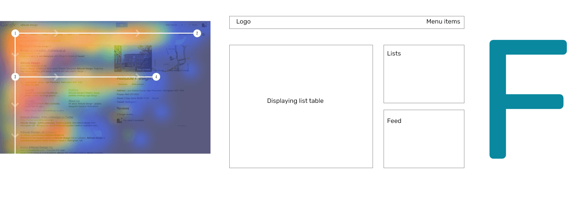
b. The Main Question: Cards vs Table

Displaying the required data could have been done in 2 possible ways. Either using a card system, which displays each piece of information in an easy on the design solutions. The other option was to implement a table system, which would structurally display data in a individual cells.

Disadvantages of using cards to display data:

  • Too much information needs to be displayed, making it unsuitable to fit into a card

  • Users will struggle in reading the data

  • Users will have a tough time sorting and filtering through the search results.

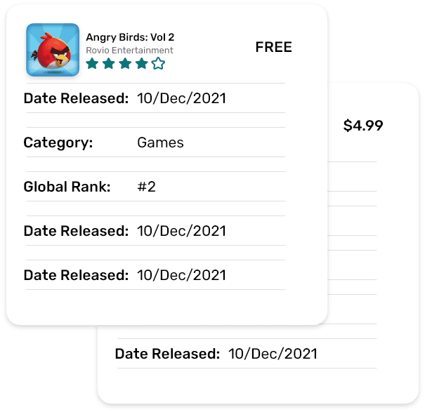
Advantages of using table format to display data:

  • Easier to handle and navigate large chunks of data

  • All information is clearly visible on one line

  • Customizable column views with quick sorting and filtering syetem.

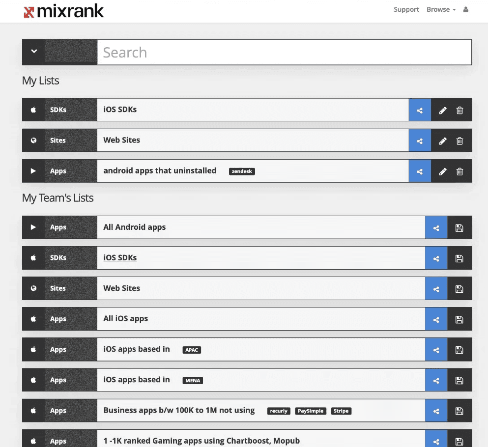
c. Pop Up System for Filters

The design solution focuses quite a bit on popups. Several functions have a pop up dialogue or action boxes that open up.

User Experience regarding Action Box/Popups

While generally, pop ups are notorious for being considered as bad UX, that is for those pop ups that annoy the user and hamper their user experience (usually to serve ads or mailing list subscriptions).

Context matters.

In this design, popups are heavily featured. They,

  • Aid the user in implementing search filters

  • Do not hamper the user flow - but instead are a part of the user flow

  • Do not distract the user.

d. User Flow

An executive wants to build a list of all apps in Europe that don't have any customer support solution integrated (to assess the greenfield opportunities in this market).

An executive wants to build a list of all apps in Europe that don't have any customer support solution integrated (to assess the greenfield opportunities in this market).

An executive wants to build a list of all apps in Europe that don't have any customer support solution integrated (to assess the greenfield opportunities in this market).

  1. Clickable Prototype - Phase 1

  1. Clickable Prototype -
    Phase 1

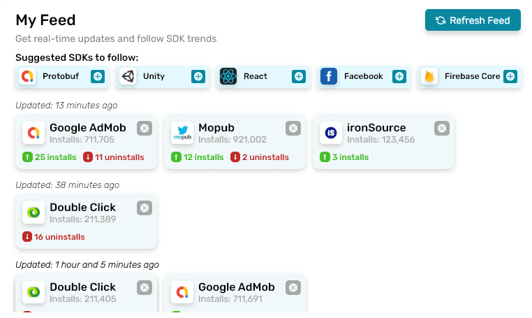
Attached below is the High Fidelity Clickable Prototype. The following features are prototyped:

Hide/Show Filters, Add Filter, Sorting options, Edit/Delete Filter, Customize Table, Select Table Rows, Table Scrolling & Pagination Hover, Country Data Popover & Hint, Advanced Search, Save Search Results, Save Filter Selection.

Hint: click anywhere on the screen and the blue hotspot will show you what's clickable.

For Advanced Search:
Countries > Europe > All
NOT
Technologies Used > Integrated Customer Support

  1. Ideation and Design - Phase 2

After the initial design, a base for future iterations was set. Next, a revamped home screen was designed, getting rid of the sidebar and shifting the navigation to the top bar. The page structure was also changed, with new features added.

Page Structure: F Shaped

The new homepage structure was designed to be in an F shape to help the user quickly analyze and scan the page for relevant information.

“Users first read in a horizontal movement, usually across the upper part of the content area. This eye movement forms the top part of the ‘F.’ Next, they scan a vertical line down the left side of the screen, looking for points of interest in the paragraph’s initial sentences. When they found something interesting they read a line and this eye movement forms a second horizontal line of the ‘F.’ The second line is typically covers a shorter area than the previous movement. Finally, users scan the content’s left side in a vertical movement.”

https://uxplanet.org/f-shaped-pattern-for-reading-content-80af79cd3394

Displaying List Table

Sort of like a preview of the main table of the selected list/search results. The user sees the new installs and uninstalls in the green and red cells on top, along with the existing ability to share and save the list (replaced by edit and delete if it is already saved). Also shows the user the name of the list and the tags associated with it.

The table itself shows important data that user’s would like to see for iOS/Android apps - it will vary for other types of data (The visible columns can be adjusted in the main table). Table is sortable in ascending or descending order by clicking on the relevant column header - as demonstrated in the “Rank” column. The company page would also accessible by clicking on the company name underneath the App name

Users can directly go the the selected list’s main table by clicking on the “Open Full Table” button. The full table will have the filter options as well as more columns and other table operations like editing the column view, pivot, sorting etc.

Note: The table for SDK’s would have the Installs and Uninstalls data clearly visible, a big priority for the user base according to the UX Research.

My Lists

Similar to the existing mixrank.com/lists webpage.

Has similar functionality. The user can scroll and click on whichever list they want and it will be displayed in the preview on the left. The list items have hover effect on them, which is also used to indicate the current selected list, as demonstrated by the “iOS Apps using Twillio” list.

The user sees the new installs and uninstalls in the green and red buttons, along with the existing ability to share and save the list (replaced by edit and delete if it is already saved). Also shows the user the name of the list and the tags associated with it, along with relevant platform icons and description.

It can have: My Lists, My Team’s Lists and Public Lists (and any other list we may want to include).

The user can search the accessible lists by the search bar on the top right.

My Feed

A new feature proposed in line with the UX Research conducted on MixRank company personnel.

User’s want to know if the SDK’s they care about have any updates or not. This simple section shows the user the update on the SDK’s they follow by showing the number of total installs, new installs and new uninstalls after each automatic update/manual refresh.

It also suggests SDK’s which the user can follow. Users can follow from right there, by clicking on the plus icon. Users can also unfollow an SDK if they want, by clicking the grey cross icon in the mini SDK card.

Refresh Feed button sends a manual request and updates the feed if for some reason it has not automatically updated with any new activities on followed SDK’s.

  1. Clickable Prototype - Phase 2

Attached below is the High Fidelity Prototype. It included initial scroll and hover interactions.

Daniyal Admaney Portfolio

UX and Product Design