
Table of Contents
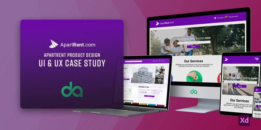
About
What is ApartRent.com?
ApartRent is an apartment listing website which provides users with numerous features like extensive filters, virtual tours, booking physical tour appointments and giving accurate neighborhood information to the users.
Problem Statement
Existing house rental websites often irk the user with inaccurate pictures/description and misleading information. User’s also usually have to do extensive research about the locations on other platforms.
Goal and Objective
A quick and easy way to look for houses to live in, with accurate and up to date information, making the user’s experience as smooth and less time consuming as possible.
My Role and Responsibilities

• Performing user research
• Conducting user interviews
• Doing competitive analysis

• Creating user personas
• Performing competitive analysis
• Building empathy and journey maps

• Leading usability studies
• Iterating on designs
• Accounting for accessibility

• Sketching wireframes
• Drawing mockups
• Implementing low and hi fidelity
prototyping
Design Process
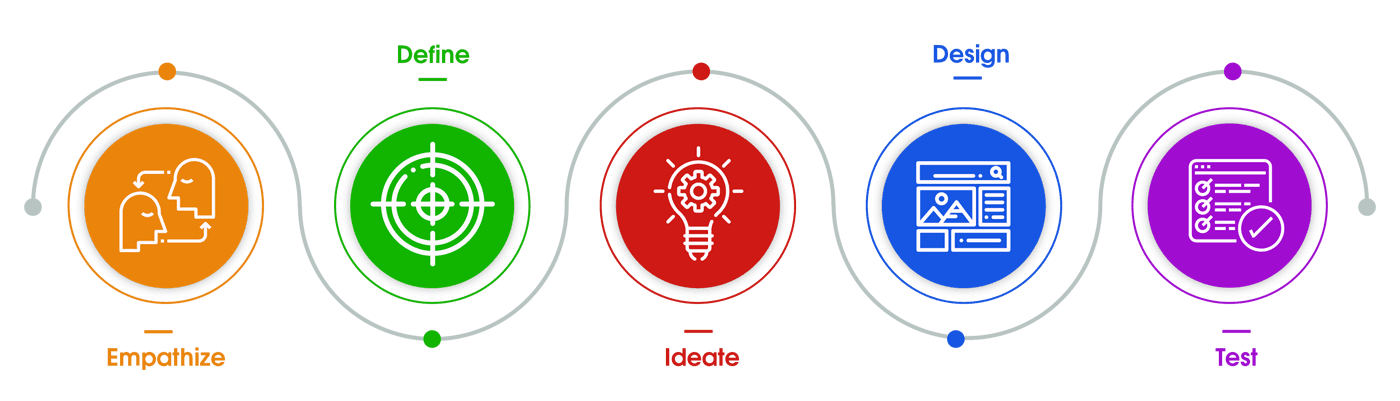
Empathize Stage
During the first phase of the process, the user’s needs, wants, priorities, pain points and frustrations were identified, using qualitative and quantative research methods. This research helped deliver key insights and findings, which were used throughout the design process.
User Research
The user research was conducted via 5 one-on-one interviews via Zoom. During the interview, opinions about experiences with apartment listing websites, user wants, needs and other relevant queries were taken from the interviewees.
From these interviews, pain points for users were identified, along with the creation of empathy maps, user personas and problem statements.

Pain Points
Inaccurate Information
Apartment rental websites often contain inaccurate pictures, insufficient descriptions and hidden costs.
Lack of Location Information
Users have to use other platforms to gain information regarding neighborhoods, like nearby transportation, grocery stores, schools etc.
Time Consuming
Dealing with real estate agents, agreeing on a time and place to meet and then physically going to inspect the house takes up a lot of time.
Outdated User Interfaces
Existing websites possess a non-modern look, which while not easy on the eye, also hampers the user experience.
Competitor Analysis
Primary and secondary competitors providing comparable solutions were studied and examined, concentrating on their responsiveness, approachability, holistic user experience, functionality, and the user interface.

User Empathy Map
SAYS
• Online websites have been a godsend but often they’re filled with misleading information.
• I want to see accurate pictures, proper details and location of the apartment mentioned.
• I should know what the neighborhood atmosphere is like.
• I would prefer an alternative to a physical inspection, since I don’t have much time to spare.
THINKS
• Inaccurate information is a big problem.
• Realistic images and descriptions will do wonders.
• Should have information about nearby facilities.
• Physically searching for an apartment is time consuming.
DOES
• Searches for apartment location on Google Maps.
• Looks for nearby facilities available on other platforms.
• If not online, then finds apartment ads in newspapers or goes to real estate agent’s office.
FEELS
• Peeved at inaccurate or lack of information.
• Irritated that he has to search separately.
• Uneasy about potentially moving to a dangerous neighborhood.
• Annoyed at real estate agents looking out for themselves.
• Frustrated that an apartment search is extremely time consuming
Define Stage
During the second phase of the process, the user’s availble information about their wants and frustrations was analyzed and were used to construct two user personas, as well as a user journey map.
User Personas


Ideate Stage
During the third phase of the process, there were several brainstorming activities performed, and the emphasis was on quantity over quality. Among these activities were How Might We, Crazy 8’s and drafting big picture and close up story boards.
Information Architecture Diagram
Information architecture is a discipline that focuses on organizing information within digital products clearly and logically.

Design Stage
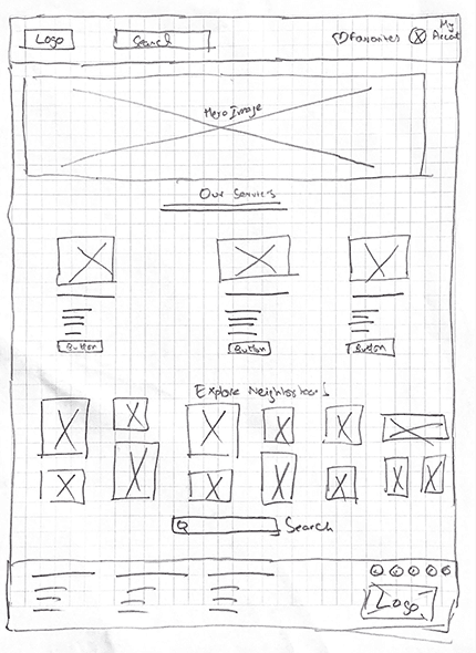
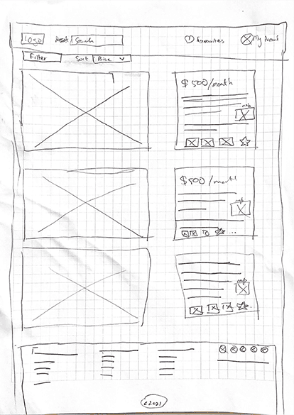
During the fourth phase of the process, the number of design ideas for the responsive webssite were shortened down and to the designs with the most efficent, user centric, accessible and the most beneficial user experience. This was done through the sketching of paper wireframes, which were then converted to a digital wireframe. Low-fidelity prototyping followed, on which there was a usability study conducted, which paved way for improvements and the eventual final mock up design and high-fidelity prototyping.
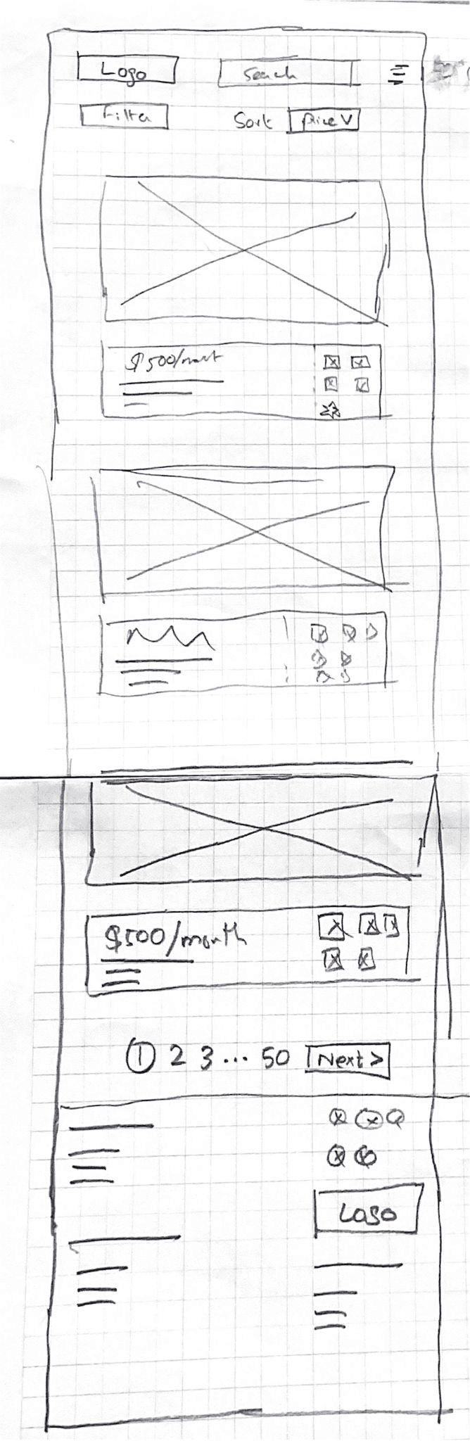
Paper Wireframes
Digital Wireframes - Responsive
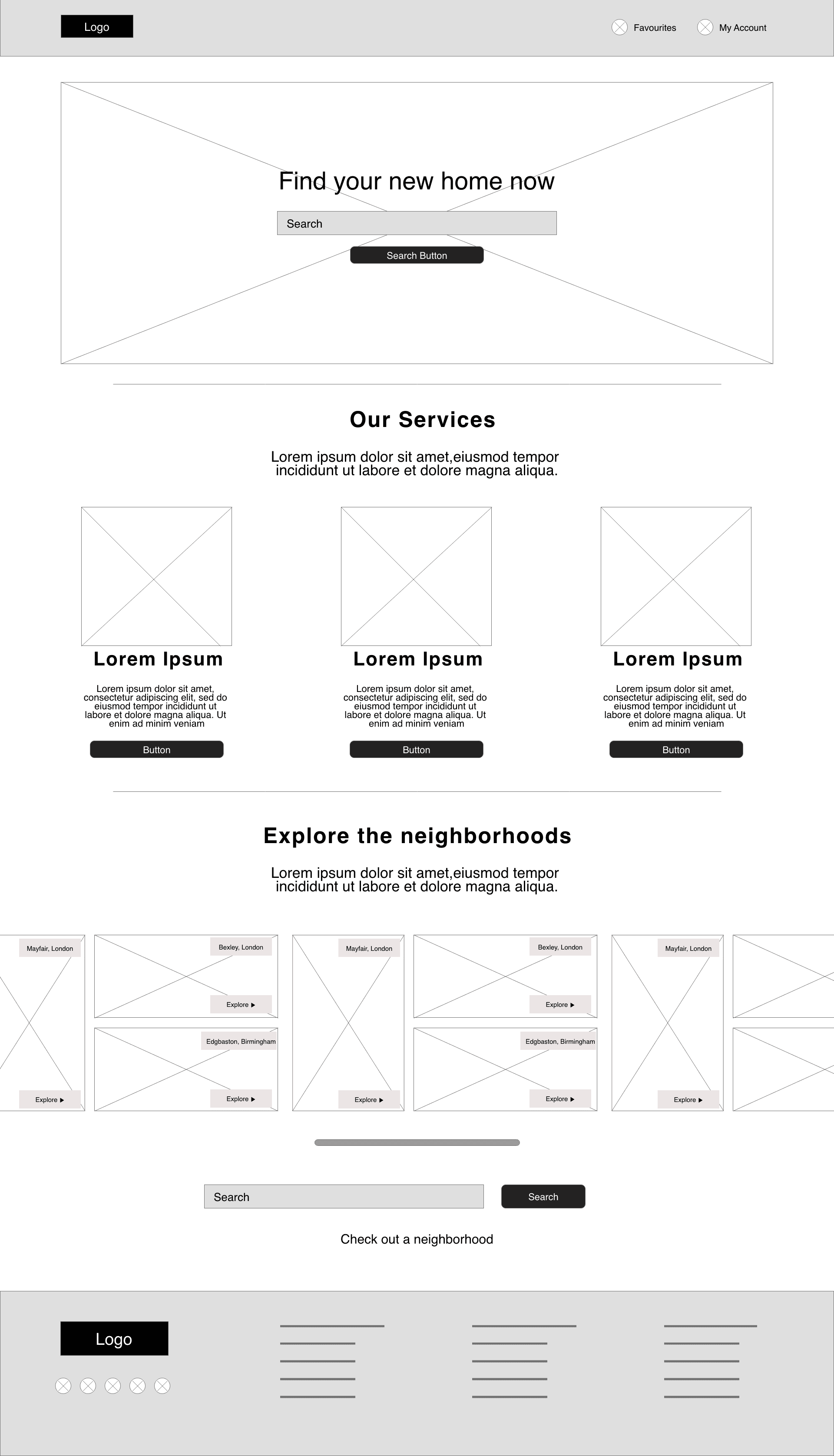
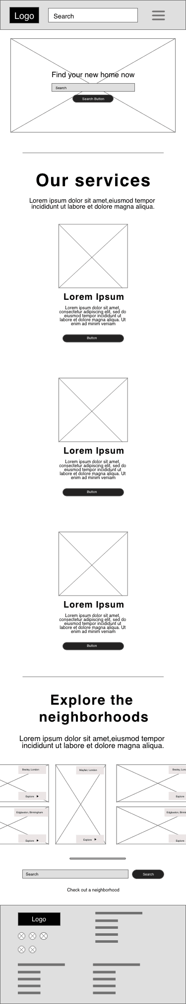
Homepage
Web, Tablet and Mobile

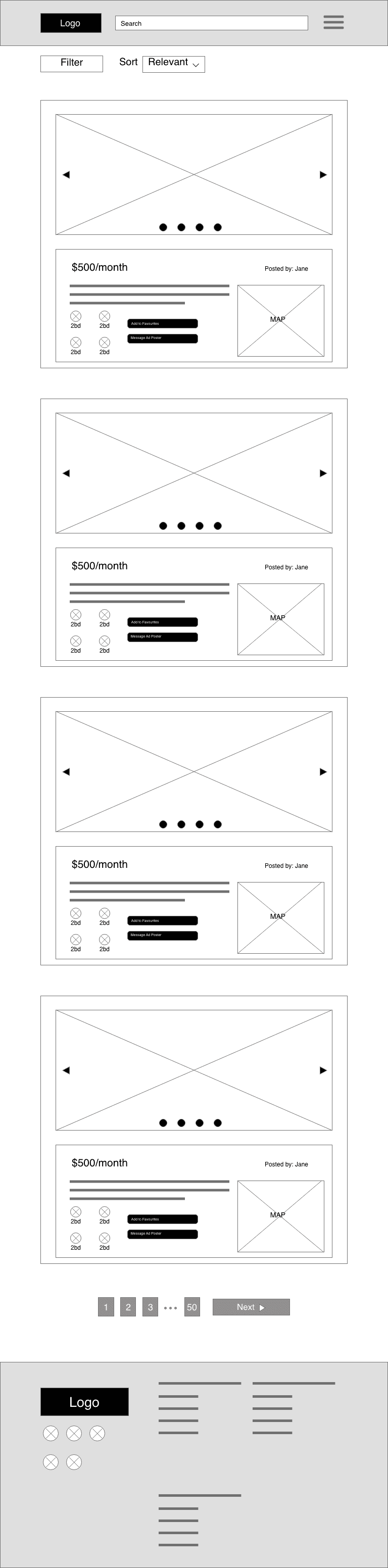
All Listings Page
Web, Tablet and Mobile


Usability Study
After the initial wireframing and low fidelity prototyping, a Usability Study was conducted. During the study, the main user flow of searching for an apartment, applying a search filter and then selecting an apartment was observed.
As a consequence of the study, further iterations were made on the wireframes which were eventually built upon to create the high-fidelity mockups and prototype.
Study Type: Unmoderated Usability Study
Location: Turkey, Remote
Participants: 5 participants
Length: 10 minutes
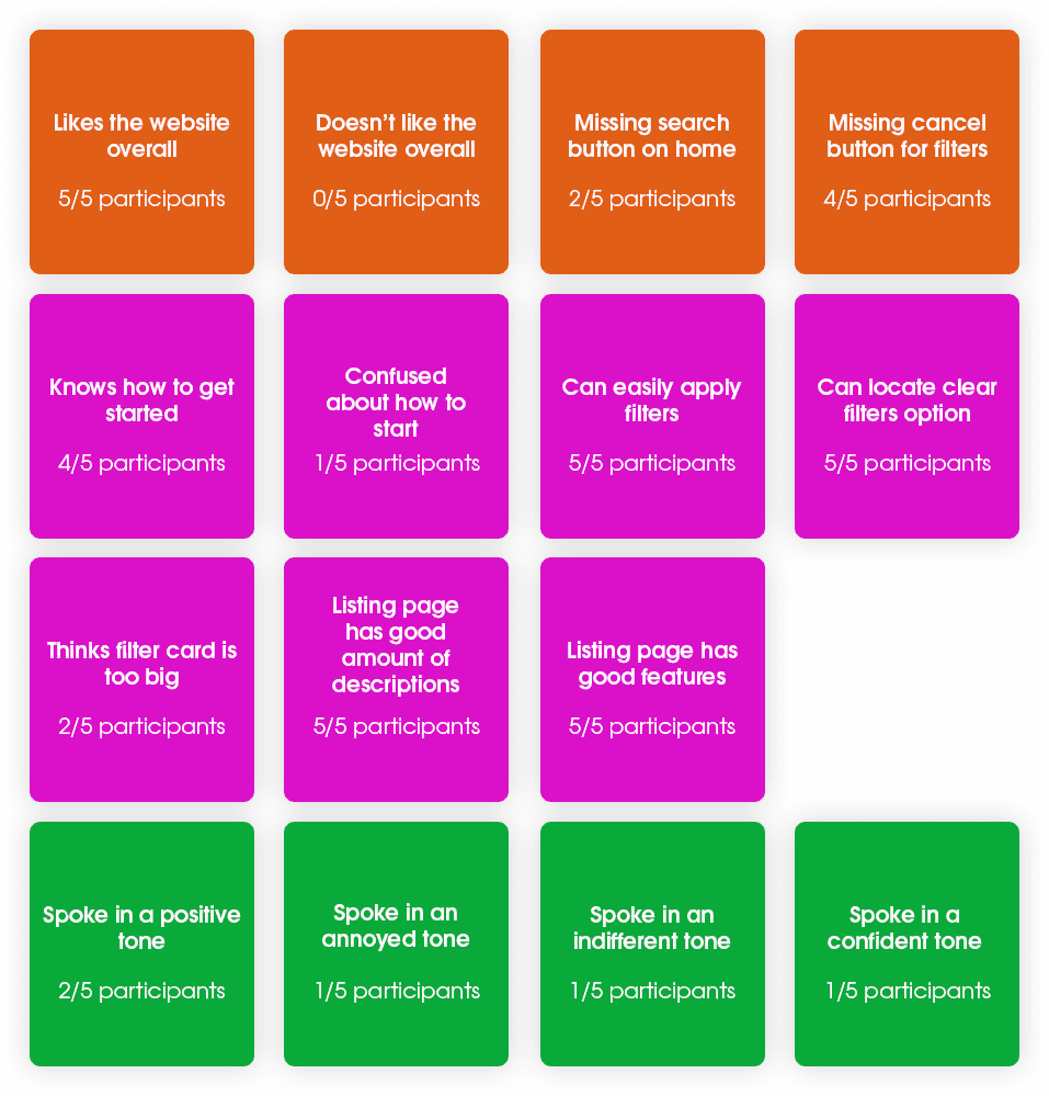
Results: Users complained about a missing search button on the homepage hero image, as well as the lack of ability to cancel the “apply filter” overlay. Some users also had issues with the size of the filter overlay - all of which were fixed in the next iteration of the wireframes and consequently the final mockups.

Affinity Mapping
From the usability study conducted on the low fidelity prototype, all observations were laid out on a board in the form of an affinity map. The different colors represent different aspects of the study.
Orange: Opinion on the overall user experience.
Pink: Completing prompts, for Searching, Selecting a Listing and using filters.
Green: Overall tone and attitude of the participant.
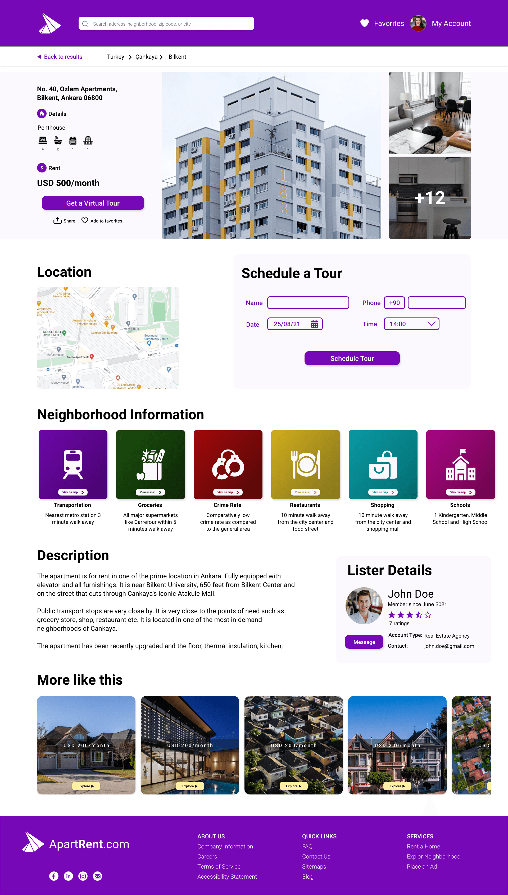
High Fidelity Mockups and Prototype
Utilizing the findings from the usability study, a final User Interface was designed, keeping in line with the wireframes designed before. The user interface design included the use of Gestalt Principles and accounts for accessiblity as per the WCAG standards.
Homepage Mockup
Web, Tablet and Mobile


All Listings, Selected Listing and Filter Popup Mockup
Web


High Fidelity Intractable Prototype
If you don’t know where to click, please click anywhere and look for the blue highlights. The prototype below is scrollable and clickable.
Major Product Features
Book An Appointment
Customers can utilize the Book An Appointment/Tour option to arrange an in-person tour of the featured site straight from the Listing page. The client simply has to choose a date and time from the open slots, and the seller/representative will be immediately informed of the appointment.
Virtual Tour
When available, visitors can experience a virtual tour of the apartment using video, 360-degree photos, and augmented reality. This enables them to gain a solid understanding of the property without needing to be present on-site.
Detailed Neighborhood Information
Every listing page features comprehensive data about the area, such as crime statistics, local schools, nearby supermarkets, proximate transit routes, and close shopping centers. All represented on an interactive, embedded map.
Easy-to-use Filter System
The user friendly filtering function aims to assist individuals in tailoring search outcomes to their unique requirements, concentrating on cost bracket, property dimensions, property classification, facilities, and lifestyle factors.
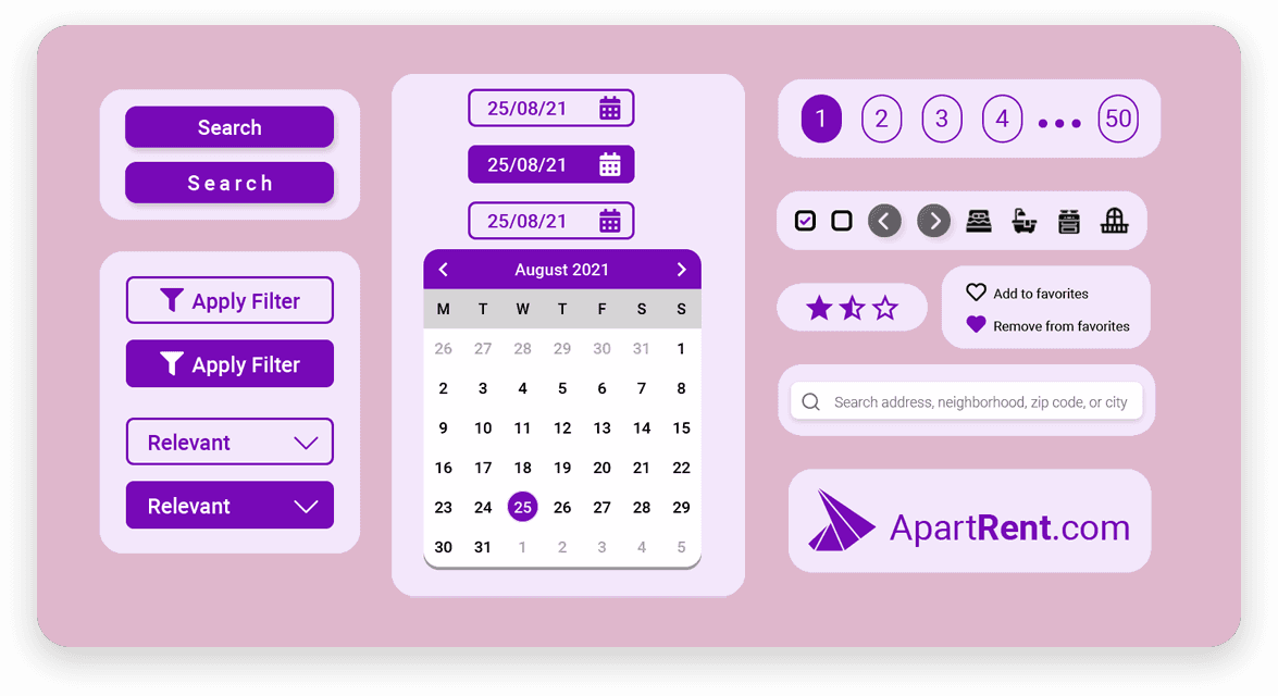
UI Kit and Design System
Typography
Roboto Bold
Roboto Medium
Roboto Regular
Aa Bb Cc Dd Ee Ff Gg Hh Ii Jj Kk Ll Mm Nn Oo Pp Qq Rr Ss Tt Uu Vv Ww Xx Yy Zz
0 1 2 3 4 5 6 7 8 9
Color Palette
Sticker Sheet
Design Validation
Usability Study
Heatmaps
To examine user behavior during the use of the software, heatmap analytics tools such as Hotjar or Smartlook to be employed to gather valuable knowledge, enhance comprehension of user behavior and flow, and empathize with users after the production stage.
Accessibility Considerations
Hierarchical Text
Utilizing various heading sizes to establish a distinct visual hierarchy in text
Utilization of an accessible and inclusive color scheme, ensuring the design preserves a WCAG ratio of 7.29:1
Screen Reader Allowance
Every primary area features labels beside them for screen reader usage
Iconography
Utilizing widely recognized icons to enhance user experience and simplify navigation.